ShopDreamUp AI ArtDreamUp

Deviation Actions


Suggested Deviants


Suggested Collections


You Might Like…


Featured in Groups

Description
Image size
4820x6579px 26.93 MB
Comments32
Join the community to add your comment. Already a deviant? Log In
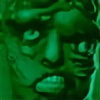
When we first started talking I believe it was the first pieces in your "Face" series. And, I have to say that this pice is now my favorite out of all of them. Even though this piece is hand drawn... it looks like it could be a photograph of a sculpture. You did an excellent job adding the highlights in just the right spots and the contrasting shadows give it that instant 3 dimensional quality. I love the fact that you did this piece on colored paper. If I'm not mistaken it's a royal blue paper right? I believe the blue of the mouth is the actual paper color. Let me know if I'm wrong because I see it in the underlying tones of the eyes and the skin. I think blue was a good choice of color since there is so much of it present in our natural skin tones. By making that choice it prevented you from having to have it lay on the surface of the skin when you added it later which usually takes way from the skin tone. The only thing I would add to this piece is a dark shadow along the left side of the inside of the mouth. Because this piece is so 3 dimensional feeling I almost feel like not having that one dark area in the mouth makes that area feel flat. By adding that I think it will make the piece "pop' even more.